

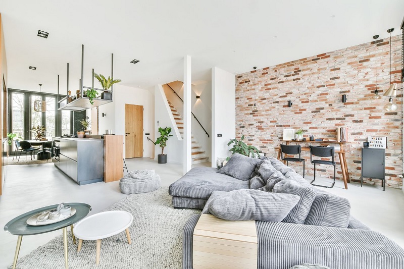
Walk into a room where the paint color is spot-on, the furniture fits the floor plan, and the lighting hits all the right marks, yet something still feels slightly lifeless. More often than not, the missing piece is not another accent color or a bigger piece of art. It is texture.
Color usually gets first billing in interior design, while texture does the quiet structural work behind the scenes. The way a woven rug absorbs afternoon sunlight next to a satin-finished oak coffee table, or how crisp cotton drapery softens a plastered wall, gives a room physical depth you can sense before you even sit down. When every surface shares the same smooth sheen or the same heavy weave, the eye skims right across the space without finding anywhere to rest. Combining textures thoughtfully fixes that flatness and makes a room feel collected over time rather than ordered from a single catalog page.
Understand How Tactile and Visual Textures Work Together
Before rearranging pillows or shopping for new finishes, it helps to separate texture into two categories. Tactile texture is what you physically register when you brush your hand across a surface: the nubby loop of a wool rug, the cool smoothness of honed marble, the slight grain of brushed brass, or the softness of washed linen. Visual texture works on the eyes rather than the fingertips. Tight wood grain, subtle veining in stone, woven cane, pleated lampshades, and patterned tile all break up flat expanses of color and add movement, even when the material itself feels completely smooth.
Strong rooms rely on both. Relying solely on tactile fabrics can make a space feel overly heavy, while leaning only on visual patterns often turns busy without feeling welcoming. The easiest way to keep them working in harmony is to pair opposites. Set a matte clay vessel on a polished stone mantel. Hang smooth, tailored linen curtains beside exposed brick or heavily grained wood trim. Place a supple leather ottoman opposite a sofa upholstered in textured tweed.
This contrast matters even more when you prefer a quiet, neutral palette. A white, beige, or gray room with uniform finishes can drift quickly toward sterile. Introduce chalky plaster walls, bleached oak floors, a hand-knotted wool rug, and blackened iron hardware in that exact same neutral spectrum, and the space suddenly carries warmth and dimension without adding a single bold hue.
Anchor the Space With Three Foundational Materials
Most texture mistakes happen because people treat texture as an afterthought, piling throws and decorative accents onto a room whose main surfaces do not talk to one another. Start instead with the largest elements in the space: the flooring, the walls, and the anchor furniture.
Aim to establish three primary material families before bringing in smaller accents. In a living room, that foundation might be warm mid-tone wood, a matte woven textile, and a hard mineral or metal. Notice how an oak coffee table, an upholstered linen sectional, and a woven natural-fiber rug can anchor a room cleanly, leaving brass shelving and glazed ceramic lamps to act as crisp supporting notes. In a dining room, the trio might be a solid walnut table, upholstered cotton chairs, and a woven wool rug beneath them, offset by glass pendants overhead.
Pay attention to visual weight as you choose these core pieces. Rough, matte, and dark surfaces absorb light and feel heavier, which helps ground a room and make large open spaces feel intimate. Smooth, glossy, and light-toned materials reflect light and feel lighter, helping compact rooms breathe. If your floors are dark hand-scraped wood and your sofa is deep velvet, balance that weight with lighter matte walls, airy curtains, and a glass or pale stone table so the room does not feel weighed down.
Build Soft Layers From the Floor Up
Textiles are the most flexible tool for adjusting a room’s tactile feel, and they work best when layered intentionally from the ground upward rather than clustered in a single corner.
Grounding the Room With Rugs and Window Treatments
Start underfoot. A rug defines a seating area and sets the baseline for every fabric above it. Flat-weave wool, sisal, jute, and low-pile knotted rugs bring organic irregularity that immediately softens hardwood or tile floors. If your sofa and chairs are already rich and textured, a quieter flat-weave rug keeps the floor from competing for attention. Conversely, if your seating has clean lines and smooth leather upholstery, a plush high-pile or braided wool rug supplies the warmth the room needs.
Window treatments carry the eye vertically and frame natural light. Hanging medium-weight linen, heavy cotton, or soft velvet drapery softens the hard perimeter created by glass panes and painted casing. Even simple woven Roman shades add subtle horizontal ribbing that breaks up expanses of drywall.
Mixing Upholstery Without Matching Sets
Matching a sofa, armchair, and ottoman in the exact same fabric flattens a room faster than almost any other design habit. Instead, vary both the material and the scale of the weave. Pair a tightly woven performance linen sectional with a brushed wool accent chair or a saddle leather club chair.
When you move on to pillows and throws, edit ruthlessly. Three pillows in distinct finishes—say, a block-printed cotton, a woven bouclé, and a solid matte velvet—create far more visual interest than six matching cushions lined up like soldiers. Varying weave scale keeps the grouping readable: fine, tight fabrics look sharper next to open, chunky weaves, and matte cottons feel richer beside a touch of subtle sheen.
Use Hard Surfaces and Sheen to Create Rhythm
A room filled exclusively with soft fabrics eventually loses its structure. Hard materials introduce clean edges, catch daylight, and give softer textiles something to push against.
Mix natural finishes rather than defaulting to uniform factory-smooth surfaces across every table and shelf. Wire-brushed oak, oiled walnut, and lightly weathered timber bring organic warmth, while honed limestone, soapstone, and travertine add quiet mineral depth. Even small touches of metal shift the mood of a room depending on their finish. Unlacquered brass and bronze warm up cool palettes and develop a gentle patina over time, while blackened steel or matte iron adds crisp definition that keeps airy spaces from feeling overly delicate.
Do not overlook sheen, which acts like a subtle layer of texture all on its own. Even within a single paint color, shifting from flat or eggshell walls to satin trim catches light differently across moldings and doors. Carry that same thinking into decor by placing matte stoneware beside blown glass, or positioning a framed mirror across from a textured plaster wall so light bounces back across the room’s rougher surfaces.
Tailor Your Texture Mix to How Each Room Functions
A winning texture combination in a bedroom rarely translates directly to a kitchen. Let the daily function of each space guide the balance between soft and hard materials.
Living rooms and family rooms invite touch, so they benefit from a roughly even split between light-absorbing textiles and grounded hard surfaces. Soft upholstery, woven rugs, and warm wood tables handle daily lounging, while ceramic pottery, metal lighting, and framed artwork keep the layout sharp.
Kitchens and bathrooms swing heavily toward hard, non-porous surfaces out of necessity: tile, quartz, porcelain, glass, and stainless steel dominate these spaces. Left unchecked, that concentration of slick finishes can feel echoey and cold. Counteract it by working warmth into the details. Reeded or flat-sawn wood cabinetry, hand-formed ceramic backsplash tile with slight glaze variations, honed rather than mirror-polished countertops, woven storage baskets, and waffle-weave cotton towels soften the hard edges without sacrificing durability.
Bedrooms call for tactile comfort near the body and restraint around the edges. Layer breathable fabrics directly on the bed—crisp percale sheets under a stonewashed linen duvet, finished with a quilted cotton coverlet or lightweight wool throw at the foot. Save rougher, earthier textures like woven jute rugs, raw ceramic bedside lamps, or wood nightstands for the perimeter where they add visual warmth without brushing against bare skin.
Texture Mistakes That Quietly Throw a Room Off Balance
Even great individual pieces can clash when texture is layered without restraint. Watch out for three common missteps that make a space feel cluttered or awkward.
The first is stacking too many aggressive textures right next to each other. Putting a chunky knit blanket on a heavy bouclé sofa over a shag rug beside a rough stone fireplace creates visual static. High-texture materials need breathing room so the eye can actually appreciate them. Let smooth painted drywall, clean wood trim, or a sleek tabletop sit between bold tactile elements.
The second mistake is lopsided distribution. If every soft, nubby item sits on one side of the room and every glossy wood or metal piece sits on the other, the space feels subtly tilted. Repeat key materials in small doses across the layout—echo the brass from a bookcase in a table lamp base across the room, or tie a wooden dining table into nearby shelving—so the eye moves effortlessly from wall to wall.
The third trap is prioritizing photo appeal over real-life wear. Heavy looped bouclé traps pet hair and snags under rings or claws; high-gloss lacquered tables broadcast every fingerprint and coffee ring; delicate silk shades fade near sunny windows. Great interiors look even better after five years of real living, which means picking textured materials that handle daily use with grace.
Bringing the Room Into Focus
Once you think a room is finished, stand in the doorway at two different times of day—once in bright afternoon light and once under evening lamps—and look at how light lands across the surfaces. Notice where the space feels dull and where it catches a soft glow. Often, swapping a single glossy lamp for textured ceramic, trading a flat synthetic rug for woven wool, or introducing one natural wood element is all it takes to click the entire room into place. When smooth meets rough and soft meets solid in balanced measure, a room stops looking staged and starts feeling unmistakably livable.

Comments are closed.